New Feature: Analytics charts, more filters, and speeeeed
What’s new in Fabman? Pretty charts, more filters, some extra speed, and lots of little details.
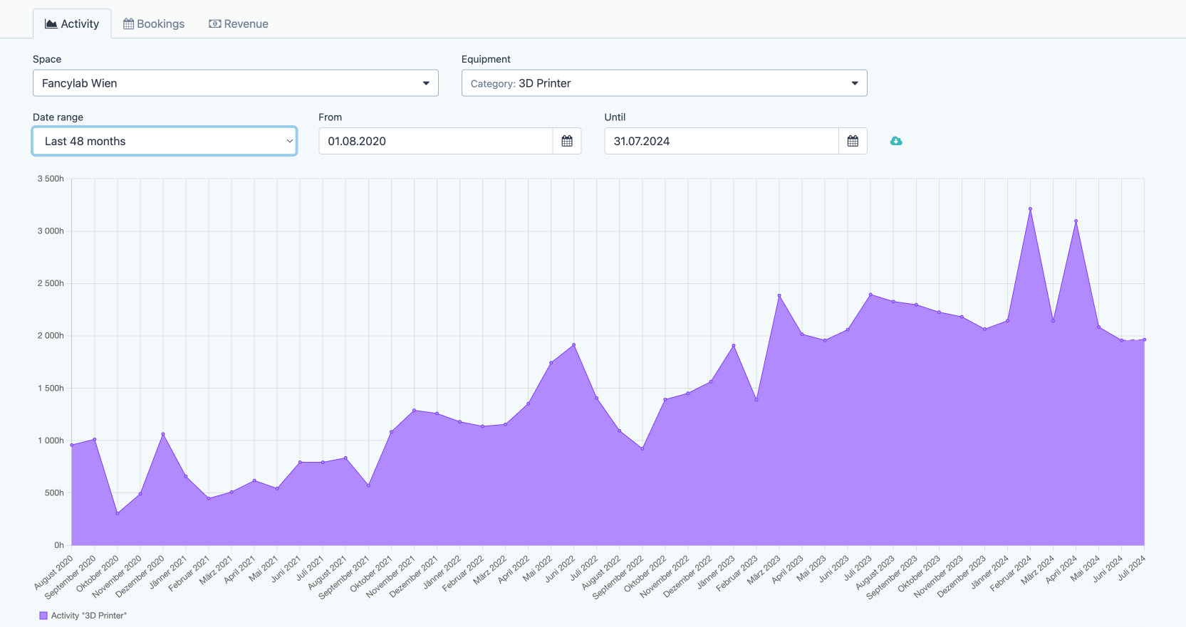
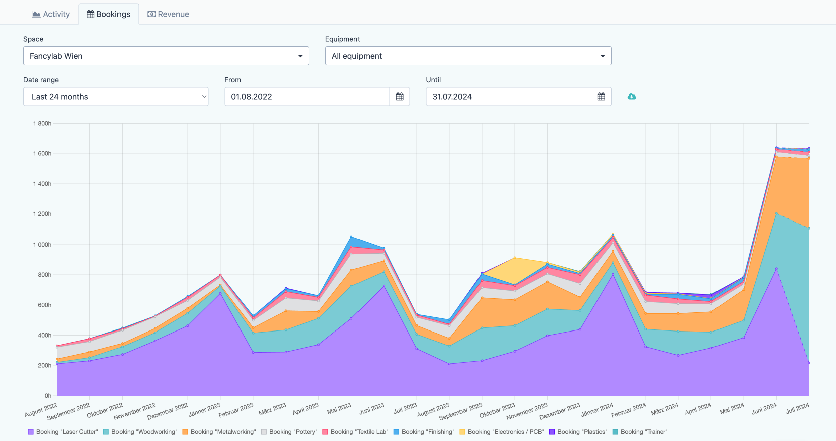
Analytics charts
We’ve added three different graphs that help you analyze what’s happening in your space. They let you see equipment usage, bookings, and revenue across time.
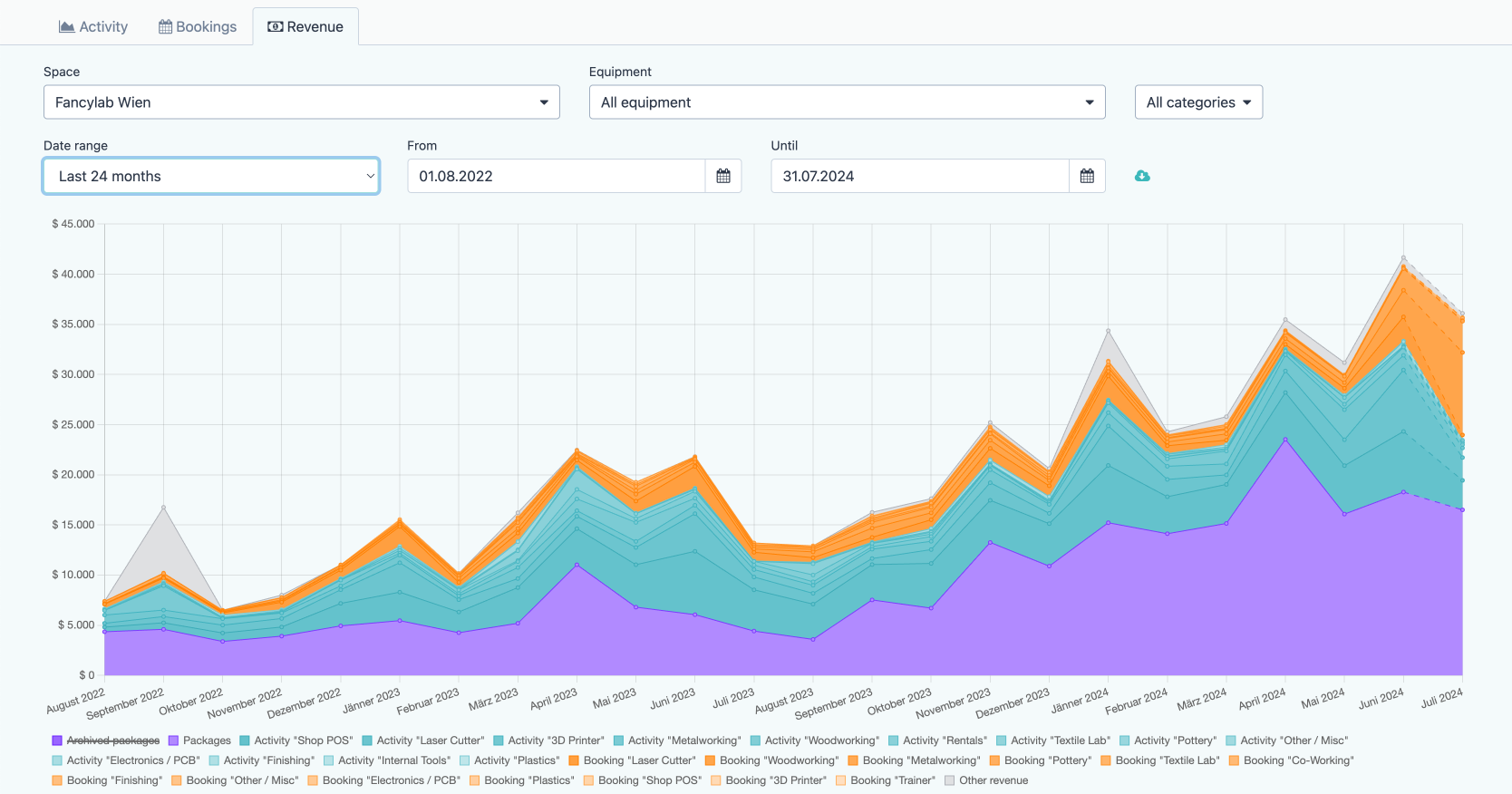
You can view your whole lab at once, filter by equipment category, or view data for individual machines.
- How has usage of our 3D printers changed over time?
- Which machines are booked the most? Has this changed recently?
- How much of our revenue comes from packages vs. usage fees?
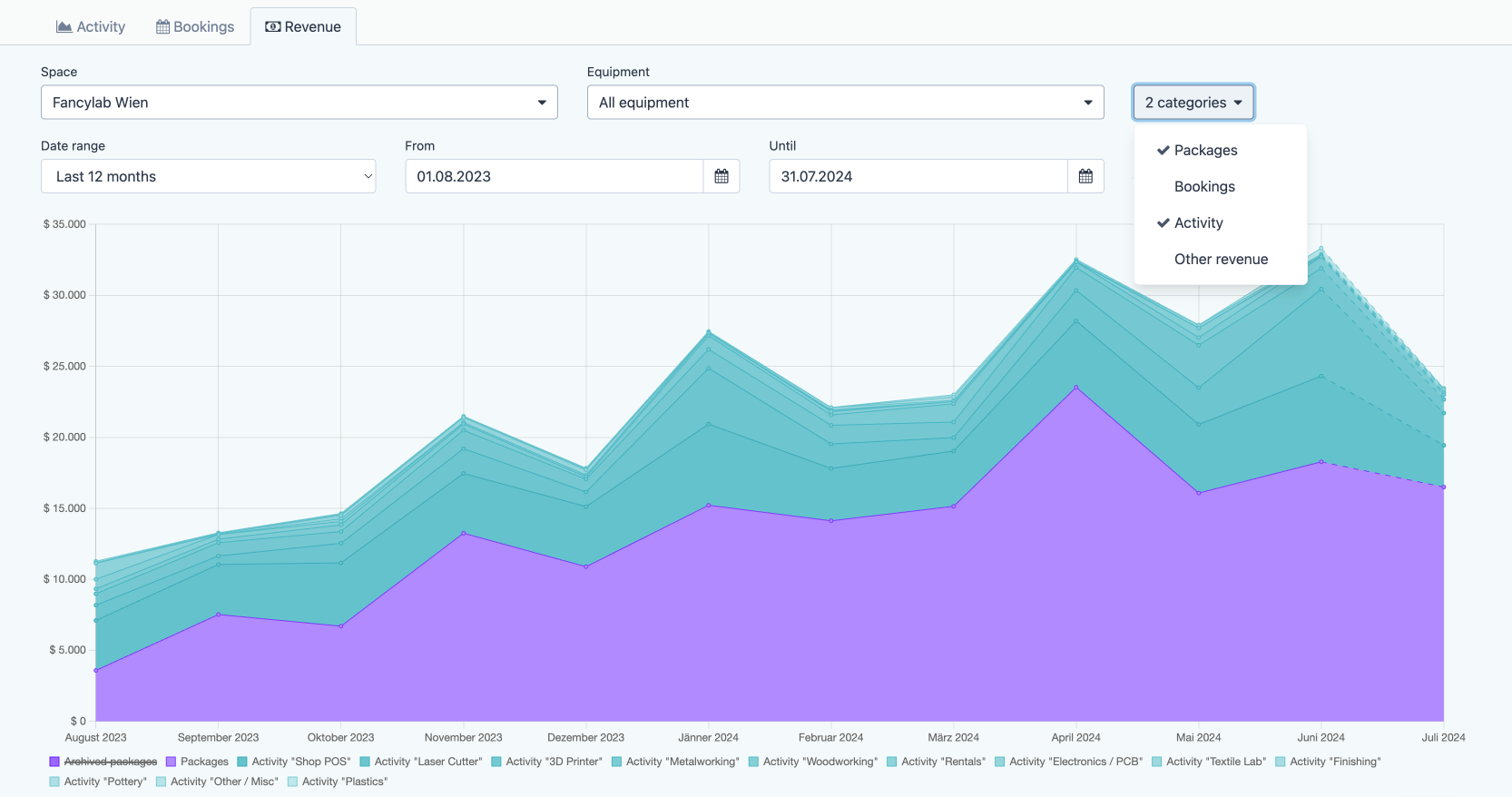
- How quickly is revenue shifting from our legacy packages to the new ones?
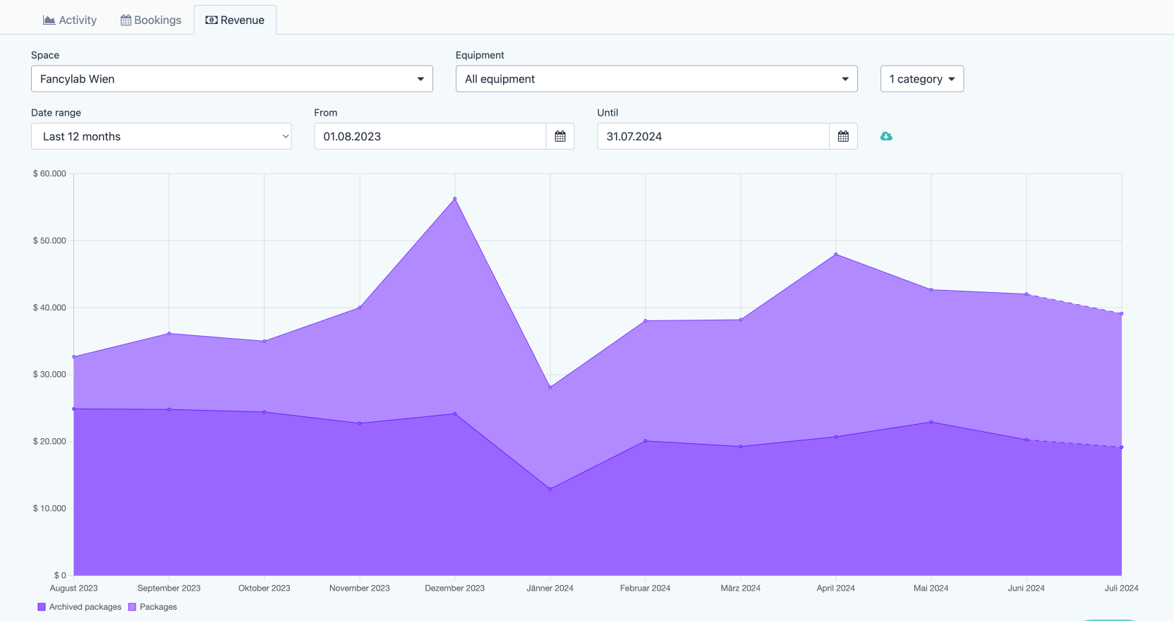
And if you want to craft your own visualizations, you can download all the data as CSV and build your own spreadsheets.
We hope this helps you to spot trends, react to changing usage patterns, and optimize you lab.
Even more filters
Our last update added more and improved filters for bookings, activities, and training courses. We’ve continued down this path:
- The package list now lets you search through name, description, and notes.
- The equipment list got additional filters for the equipment category and space (if your account has multiple spaces).
Speed improvements
We’ve turned various knobs, greased a few gears, and pulled all kinds of levers to make Fabman even faster:
- Deleting member packages is now significantly faster.
- All credit-related pages and API endpoints are now significantly faster.
- Webhooks: “resourceLog” events related to bridge usage are now delivered much quicker.
- Activity log pages and API endpoints are a bit faster.
- The invoice list and related API endpoints are a bit faster.
In addition, each webhook’s detail page now shows how long it took your webhook server to respond to each event. This helps you track down if and when your webhook server is having performance issues, which can negatively impact the delivery of events.
Other changes
Here are some of the other improvements we have shipped since the last blog post:
- The member changelog now also tracks changes to member privileges.
- If you send members a payment request via email, that email now also contains links to the PDFs of all related invoices.
- Any emails you sent to members now use your space’s contact email address as the reply-to address. (It falls back to using the email address of the admin that sends the email if you haven’t set a contact email address for your space.)
- If you download the invoice list as CSV it now also contains the net amount as well as the total tax for each tax category.
- If your account’s locale used the 12-hour AM/PM time format, the Fabman bridges now also use that time format for upcoming booking times (as of bridge firmware version 5.10).
- You can disable the bridge NFC card reader in your account settings (see this forum post for why this might be useful).
- Added the ability to delete you account logo. (Previously, you could only replace it.)
- Fixed confusing & imprecise text in emails sent for “Request payment via link” payments.
- Fixed that assigning an activity to another member did not move its charges to the new member if the charges had previously been invoiced and that invoiced then got cancelled.
- Revised the default equipment categories for new accounts.
- Added a documentation link to the “idle/busy” pricing options for equipment.
- Member app: Fixed that equipment descriptions were shown in full (instead of only showing a preview) in Chrome if they mostly consisted of large images.
- API: “GET /resources” and “GET /resources/{id}” now include “stoppedAt” and “stopType” in their “lastUsed” details. Among other things, this allows you to see if a resource is currently being used even if does not have a bridge.
- API: Fixed an error when sending an empty “embed” query param (affected several endpoints).
- The live API documentation did not mention the valid values for “embed” and “resolve” query parameters. (It used to do that but that information got lost at some point.)
- Fixed that trying to send a payment email to a member without an email address showed the error “The member’s email address was not accepted by Stripe” instead of pointing out the missing address.
- Fixed a “Conflict” error when trying to save a payment after clicking “Send email”.
- Fixed an “Oops” error when filtering the activity log or bookings list by both equipment and space when the equipment did not belong to that space.
- Fixed an “Oops” error when trying to open the booking calendar before adding any equipment to your account.
- Fixed an “Oops” error when clicking on a “Download list as CSV” button while a drop-down (like the member filter) was open.
- Fixed that saving the invoice settings failed with an unspecific error if you tried to set the next invoice number to “0”.
- Fixed that resource notes could be visible to members via the API.
- Fixed an issue if you left frequently updated lists like the activity log open for a very, very, veeery long time and then continued scrolling downwards.
- Fixed a recently-introduced error when trying to set “always closed” opening hours.
- Fixed that Stripe payments could show the wrong date (+/- one day) if they were created in a non-UTC timezone.
- API: Fixed a 500 error when trying to attach a payment method obtained via a Stripe Terminal to a member. (This is not supported by Stripe and now returns a descriptive error message.)